

Guides
These guides give practical help for preparing, checking and approving commercial print. Use them to avoid common file issues, choose suitable finishes and send work through with fewer delays.

What You Will Find In These Guides
This section brings together the key print notes most business buyers, agencies and studio teams need before a job goes to press. The focus is on everyday commercial work such as brochures, magazines, annual reports, flyers, stationery and leaflets, with plain explanations rather than technical jargon.
If you already know what you are printing, go straight to the guide that matches the stage you are in. One page covers file preparation, another explains black backgrounds, another deals with checking proofs, and there are separate notes for colour passing on press and for finishing options. That makes it easier to sort out the right issue first, instead of guessing and then having to rework artwork later.
- Use Preparing print files when setting up size, bleed, images and fonts.
- Use Black backgrounds if your artwork includes large dark panels or reverse text.
- Use Checking proofs before you approve output for print.
- Use Passing colour on press when a job needs close colour review.
- Use Finishing options to compare folds, binding and cover treatments.
Start With The Right File Setup
Good print usually starts with a tidy file. The most common problems we see are missing bleed, low image resolution, unexpected colour shifts from RGB artwork, and pages exported in the wrong order. These issues can hold up a medium-run litho job or even affect a short digital run, so it is worth checking them before upload.
As a general rule, build artwork at final size, add the required bleed on all sides, and keep important text away from trim edges. For multi-page work such as magazines, catalogues or annual reports, page consistency matters just as much as image quality. A neat file helps with proofing, plate output where needed, and smoother finishing after print.
- Set page size to the final trimmed size.
- Include bleed where images or colour run off the edge.
- Supply images at suitable resolution for print, not just for screen use.
- Check that black text is clean and sharp, especially in smaller point sizes.
- Make sure fonts are embedded or outlined where appropriate.
Digital Or Litho: Which Route Suits The Job
One of the most useful early decisions is whether the job belongs on digital or sheetfed litho. The right choice depends on quantity, turnaround, colour expectations, paper choice and how consistent the result needs to be across the full run. If you choose the process to suit the job from the start, approval tends to go faster and finishing is easier to plan.
For many Durban and KwaZulu-Natal clients, the split is fairly simple. Short-run promotional pieces often suit digital, while magazines, brochures and annual reports with stronger volume and stricter colour consistency usually lean toward litho.
- Digital printing: good for shorter runs, quick repeats, flyers, postcards, leaflets and day-to-day stationery.
- Litho printing: better for medium runs, stronger consistency across longer quantities and polished full-colour corporate work.
- Digital proofs and quick checks: useful when you need to verify layout, copy flow or basic colour direction before full production.
- Press colour review: worth considering when brand colour and image balance matter closely.
Checking Proofs Before Approval
A proof is the point where small mistakes are still cheaper to fix. Before sign-off, check spelling, image placement, page order, folios, contact details, tables, fine rules and any legal or financial wording. For annual reports and other document-heavy work, this stage needs careful attention because late corrections can affect several pages at once.
When you review a proof, check it in good light and compare it to the latest approved artwork version. It helps to have one person responsible for collating all corrections, rather than several people sending mixed comments. That usually avoids crossed instructions and last minute confusion, which can happen easily on busy jobs.
- Confirm the latest copy has been used.
- Check page sequence and pagination.
- Review crop, trim and bleed areas.
- Look closely at reverse text on dark backgrounds.
- Approve only when content and layout are both correct.
Colour Expectations And Dark Backgrounds
Colour on screen and colour in print are not the same thing, so it helps to set expectations early. Screen brightness, office lighting and paper type all affect how a job is viewed. Coated stock can make colour appear cleaner and sharper, while uncoated stock can soften solids and absorb more ink. In coastal humidity around Durban, paper handling also matters because stock can react differently if it is not managed properly through production.
Large black or very dark backgrounds need extra care. If a black panel includes small reverse text or fine lines, the wrong build can make type look fuzzy or weak. The dedicated black backgrounds guide explains when to keep text simple, when to avoid over-complicated dark builds and how to reduce the risk of patchy-looking solids.
Finishing Choices That Affect The Final Result
Finishing changes how a printed piece feels in the hand and how well it performs. Folding style, binding method, trimming accuracy and cover finish all influence the final impression. A brochure that mails out to clients may need a different finish from a magazine for events or a corporate report handed to stakeholders.
Use the finishing guide when you need a plain comparison between the common options. It can help you decide before asking for a quote through the website form.
- Saddle stitching: suited to lighter multi-page booklets and many magazine style jobs.
- Perfect binding: suited to thicker publications where a square spine is preferred.
- Matt cover finish: lower glare, more understated appearance.
- Gloss cover finish: brighter look with stronger visual pop on images.
- Folding options: useful for leaflets, inserts and product handouts where panel order matters.
If you are unsure, send the intended page count, final size and use case through the contact page and we can point you to the best guide first.
Explore the range
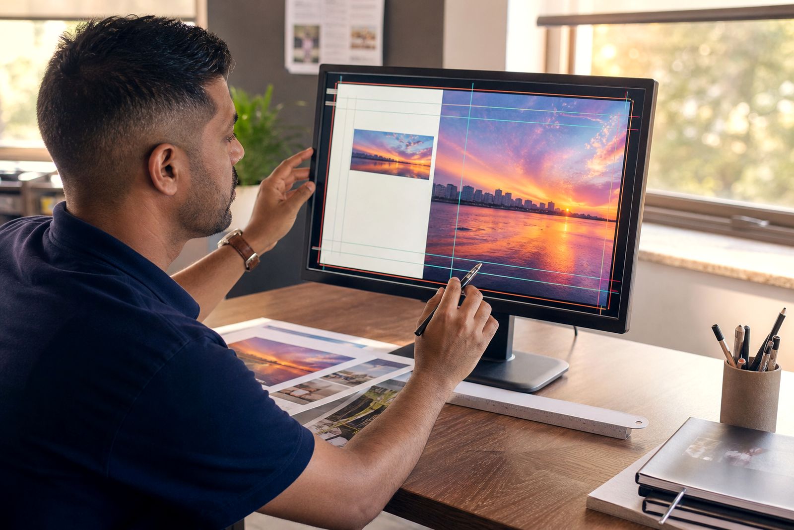
Preparing print files
A practical file setup guide for cleaner colour, fewer corrections and smoother print approval.
Read more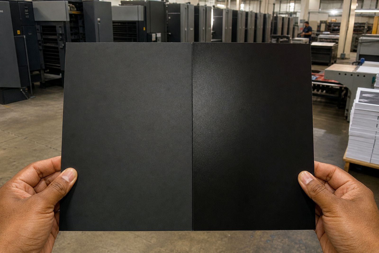
Black backgrounds
A practical guide to richer black solids, cleaner text and fewer surprises on press.
Read more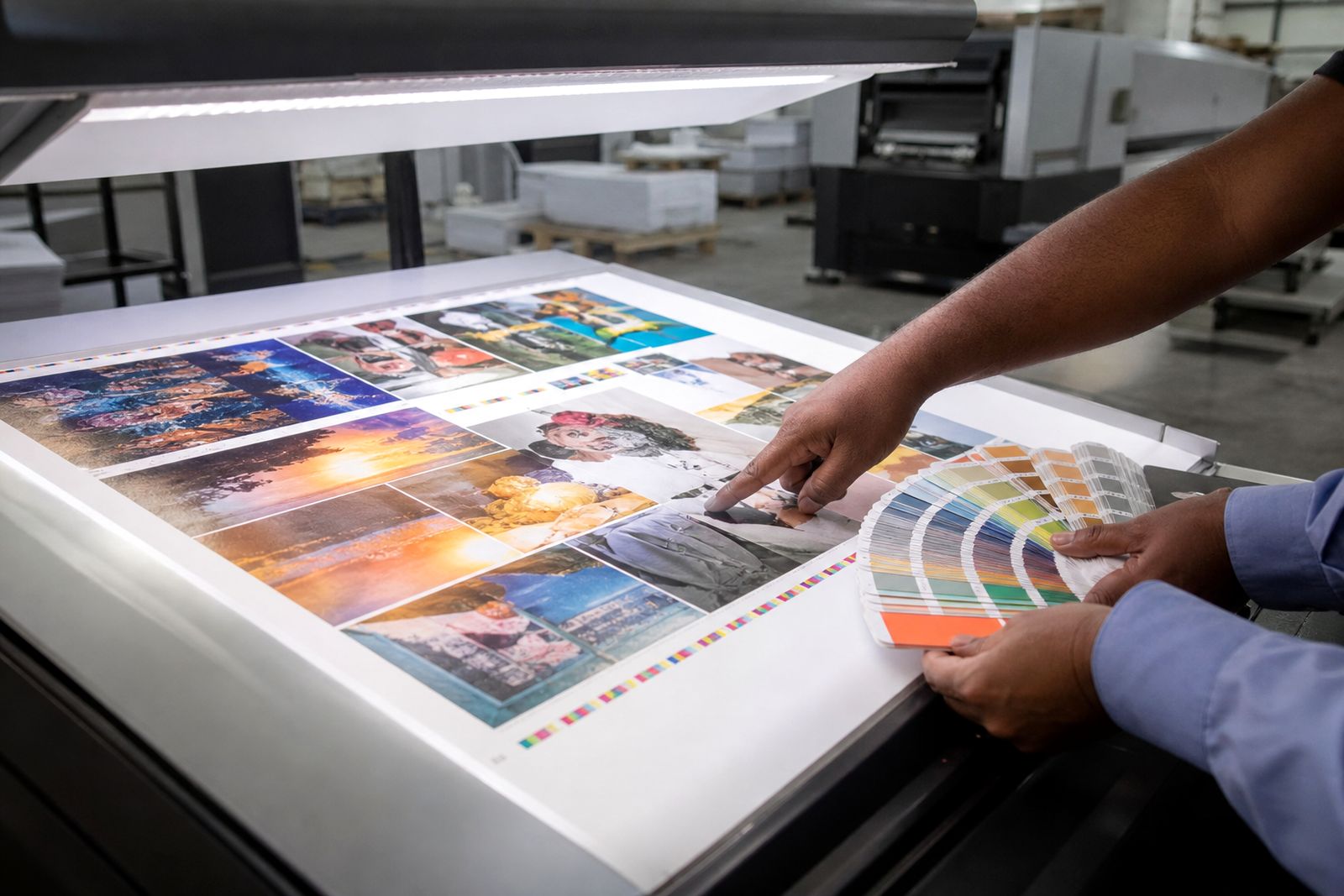
Checking proofs
Use this checklist to approve proofs with fewer errors and better print results.
Read more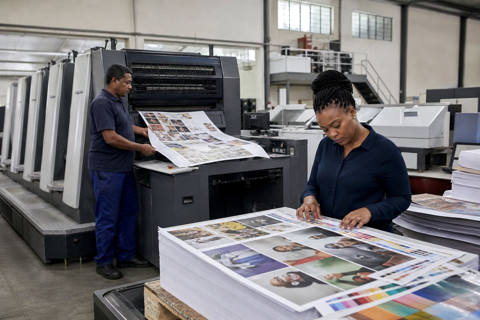
Passing colour on press
Know when a press check matters and what to check before you sign off colour on press.
Read more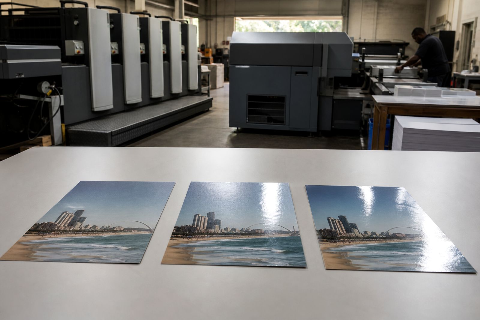
Finishing options
A practical guide to varnish, laminate, folds and binding for everyday commercial print.
Read moreWhat our Commercial Printing customers say
Verified Google reviews
Questions we get asked
Which guide should I read first if I have not printed this item before?
Start with Preparing print files. It covers the setup points that affect most jobs, then move to Checking proofs and Finishing options if your artwork is already built.
Do I need a press colour check for every job?
No. It is usually most useful for colour-sensitive litho work such as magazines, brochures and annual reports where image balance or brand colour needs closer review.
Can I send files through the website?
Yes. Use the Send your files page for upload guidance, and use the contact or quotation request form if you need help before sending final artwork.
Ask for a quote
Send a note through the contact form with your print job, quantity, size, finish and delivery area, and the team will reply with a quote.
Open the contact form