

Black backgrounds
Large black areas can print very differently from the black you see on screen. This guide explains why rich black usually gives a deeper result than flat black, and when plain K-only black is still the right choice.
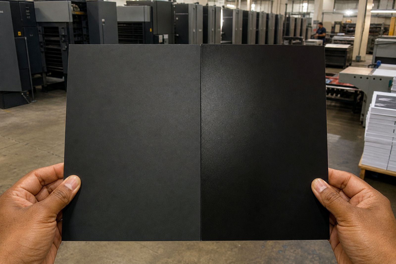
Why flat black often looks weak
In print, 100% black on its own is usually just the K channel. That works well for body text, rules and small elements, but on a big background it can look dull or slightly washed out. On coated stock especially, a large K-only panel may appear more charcoal than deep black.
This happens because a broad solid area shows every small variation in ink laydown, stock absorbency and viewing light. A black made from K only can print cleanly, but it does not always have the depth most clients expect on brochures, magazines and corporate covers. Rich black adds measured amounts of cyan, magenta and yellow with the black channel so the area reads darker and fuller on the sheet.
For business print in Durban and across KwaZulu-Natal, this matters on items handled under mixed lighting, in boardrooms, reception areas and retail spaces. A black that looked fine on a monitor can seem thin once printed, so it helps to decide the build before artwork is supplied.
What rich black means in practical terms
Rich black is a black build that combines K with other process colours. There is no single formula for every job. The right build depends on stock, image content, press conditions and total ink coverage allowed for the sheet. For that reason, printers often work to a house standard or adjust the build during prepress.
A common approach for large backgrounds is a controlled mix such as:
- 40C 30M 30Y 100K for a neutral deep black
- 30C 20M 20Y 100K where lower total ink is preferred
- A cooler black with extra cyan for technical or modern looking artwork
What you should avoid is guessing a heavy mix without checking total area coverage. If the build is too dense, drying can slow down and sheets may mark, offset or scuff during finishing. On uncoated stock, too much ink can also make solids look muddy rather than clean.
If you are unsure, rather ask for the preferred rich black build before exporting the file. It saves time later and keeps colour passing more consistent across the job.
When to use K only and when not to
The simplest rule is this: use K only for small text and fine black detail, and use rich black for large solid backgrounds. Small type built from four colours can misregister on press. Even a slight shift may cause coloured edges or a fuzzy look around letters. That is why black text under about 18 pt is usually best kept to 100% K only.
Use caution with the following artwork elements:
- Body copy, captions and legal text: K only
- Fine lines and small icons: K only
- Large background panels: rich black
- Big display headings reversed out of black: rich black background, but check trapping and proof carefully
- Black-and-white photos: ask whether they should stay greyscale or convert to CMYK for the chosen output route
This split approach keeps readability high while still giving you a stronger black where it is most visible. It is a small setup choice that makes a big difference on finished print, and it avoids the soft edges that can happen when tiny text is built from several plates.
Setting up black backgrounds in your artwork
Before you export a print PDF, check the black panels properly. Many artwork problems start when a designer duplicates on-screen settings from one job to another without looking at scale, stock or finish. A rich black that worked on a gloss brochure may not be ideal for a folded leaflet on lighter paper.
Use this preflight checklist:
- Confirm whether the background should be K only or rich black
- Check that all large black panels use the same CMYK build
- Keep small text and hairlines at 100% K only
- Make sure transparency effects do not alter the black mix unexpectedly
- Review total ink coverage for the chosen print method and stock
- Allow for bleed on all background edges, usually 3 mm unless specified otherwise
- Export to the required PDF setting with fonts embedded and images linked correctly
Also zoom into joins, knockouts and image edges. Rich black next to K-only black can look mismatched if the two touch directly. If a logo, rule or text block sits on a black panel, it is worth checking the contrast and trapping very carefully. A few minutes here can prevent an avoidable reproof later.
How stock and finish affect the result
Black does not look the same on every sheet. Coated paper usually holds a denser, cleaner solid than uncoated stock because less ink sinks into the surface. On uncoated papers, a rich black may still look softer and warmer. That is normal, and it should be planned for rather than treated as a fault.
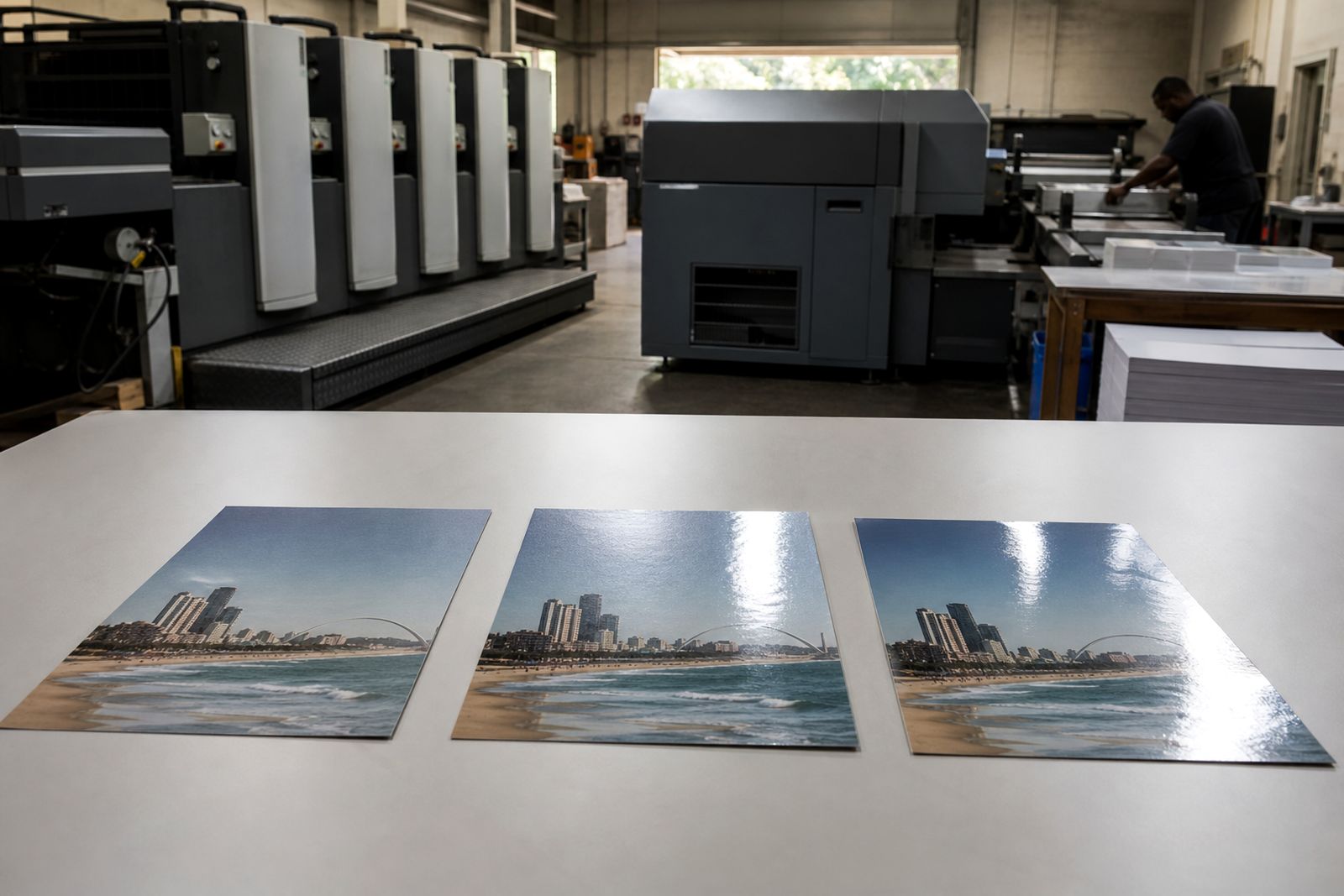
Cover finish also changes the way black is seen. A gloss or satin laminate can deepen the appearance of a black cover, while a matt surface may soften it slightly. Spot UV over a black area can increase contrast, but only if the underlying solid is even. If the panel is patchy, the finish can make the variation more noticeable not less.
Humidity along the coast can affect paper behaviour during storage and finishing, so steady production handling matters on jobs with large dark solids. That does not change the file setup rules, but it is another reason to proof and check big black areas with care, especailly on covers and heavy folds.
Proofing checks before the job runs
A screen preview is not enough for critical black backgrounds. Monitors are backlit and naturally make dark colours appear richer than ink on paper. If the job includes full black covers, large folder panels, annual report dividers or high-value promotional pieces, proofing is worth the extra step.
When you review a proof, check these points:
- Does the black background look deep enough for the purpose of the piece?
- Is there any visible banding, mottling or uneven coverage?
- Do black panels match from page to page where they should?
- Is small black text crisp and free from coloured fringes?
- Do reversed-out elements hold clearly against the black?
- Will the chosen finish change the look in a way you want?
If anything looks off, raise it before approval. It is far easier to correct a black build in file preparation than after plates are made or digital output has started. When in doubt, send the artwork through the website form and ask for guidance on the best black setup for the size, stock and print method you need.
What our Commercial Printing customers say
Verified Google reviews
Questions we get asked
Can I use rich black for all black text?
No. Small text and fine detail should normally stay at 100% K only. Rich black text can misregister and look fuzzy, especially at smaller sizes.
Is 100% K ever the right choice for a background?
Yes, sometimes on short-run work, simple internal documents or where a lighter black is acceptable. For large premium-looking solids, rich black usually gives a better result.
Will rich black look the same on litho and digital printing?
Not always. Output methods, toner or ink behaviour and stock choice can all shift the appearance slightly. That is why proofing and checking the file setup are important.
Also worth a look


Ask for a quote
Send a note through the contact form with your print job, quantity, size, finish and delivery area, and the team will reply with a quote.
Open the contact form